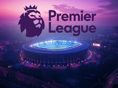
What is the Premier League?
The Premier League is the top professional football league in England. It was established in 1992 after the restructuring of the Football League First Division. The Premier League consists of 20 teams that compete for the title each season. It is highly regarded as one of the most prestigious and competitive football leagues in the world.
History of the Premier League
The Premier League has a rich history that dates back to the late 19th century. The Football League, which later became the Premier League, was founded in 1888. It consisted of 12 clubs and was the first professional football league in the world.
Importance of Logos in the Premier League
Logos play a vital role in the identity of Premier League teams. They are not just symbols but also represent a club’s history, values, and character. A well-designed logo can create a strong brand image and enhance a team’s marketability. Logos are seen on team jerseys, merchandise, and are displayed prominently in stadiums. They are a visual representation of a club’s identity and help fans connect with their favorite teams.
Evolution of Premier League Logos
The Premier League logos have evolved significantly over the years. Each team has gone through multiple logo changes, reflecting the changing times and design trends. The logos have become more modern, streamlined, and visually appealing. Let’s delve into the logo histories of some Premier League teams and explore the transformations they have undergone.
Premier League Team Logos
Chelsea Logo History
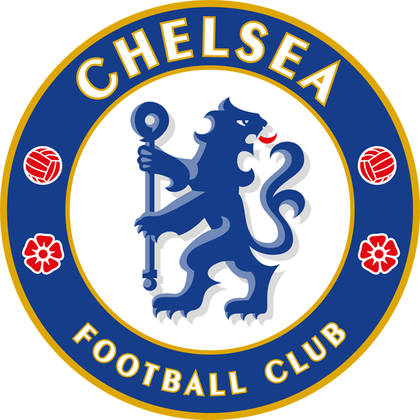
Chelsea Football Club’s logo has seen several transformations since its inception. The earliest logo featured a lion emblem and the club’s name. Over the years, the logo has been simplified and modernized, while still retaining the iconic lion symbol that represents strength and power.
Arsenal Logo History
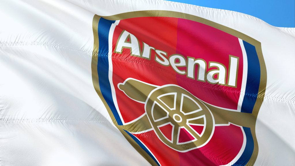
Arsenal Football Club’s logo has a rich history that dates back to its founding in 1886. The early logos featured a detailed coat of arms with a cannon symbolizing the club’s historical connection to the Royal Arsenal. In recent years, the logo has been simplified and streamlined, reflecting a more modern aesthetic.
West Ham Logo History
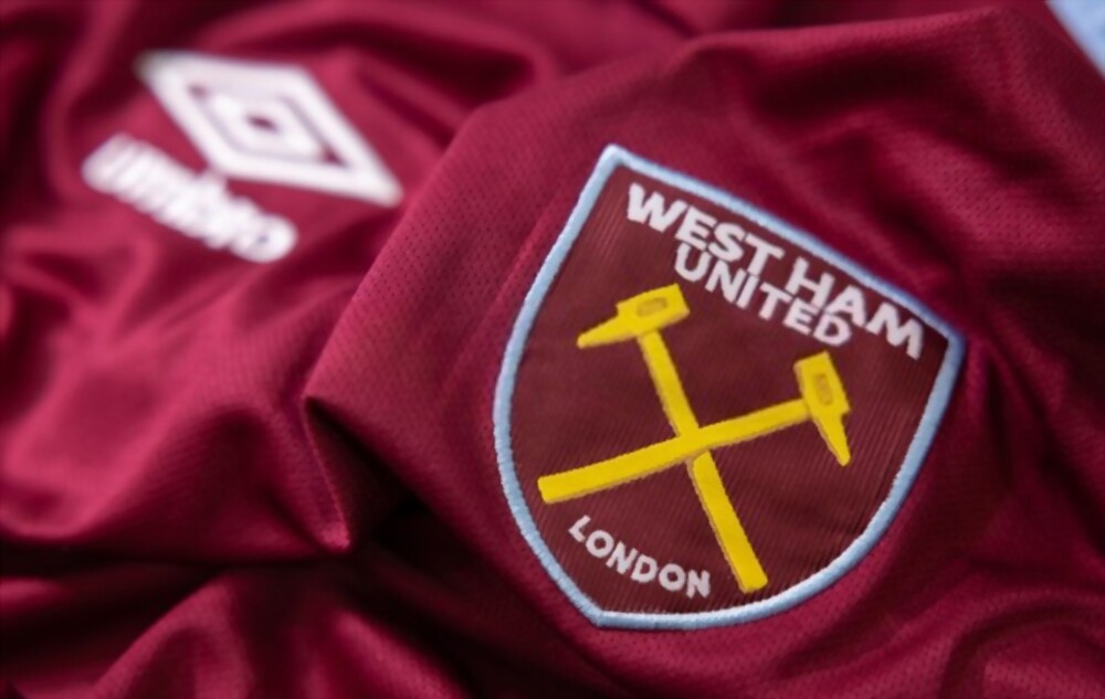
West Ham United Football Club’s logo has undergone several changes since the club’s establishment in 1895. The early logos incorporated the club’s iconic crossed hammers, symbolizing the club’s historical ties to the Thames Ironworks and Shipbuilding Company. The current logo features a simplified and stylized version of the crossed hammers, creating a strong and recognizable brand identity.
Crystal Palace Logo Evolution
Early Logos of Crystal Palace
Crystal Palace Football Club’s early logos featured an eagle, representing the club’s nickname, “The Eagles.” The eagle motif has been consistently incorporated into the club’s logo throughout its history. The current logo features a modern and stylized representation of an eagle, showcasing the club’s evolution and contemporary design trends.
Tottenham Hotspur Logo Journey
Tottenham Hotspur Football Club’s logo has evolved significantly over the years. The early logos featured a cockerel, representing the club’s nickname, “The Spurs.” The current logo features a simplified and streamlined version of the cockerel, reflecting a more modern and minimalist design approach.
Fulham Logo Transformation over the Years
Fulham Football Club’s logo has seen several transformations throughout its history. The early logos featured various symbols and typography. The current logo incorporates a simplified and modernized version of the club’s initials, creating a clean and contemporary design.
Badge Changes for Manchester City
Manchester City Logo Timeline
Manchester City Football Club’s logo has gone through multiple changes since its establishment in 1880. The early logos featured the club’s name and various symbols. The current logo, introduced in 2016, features a simplified and modernized design, incorporating the club’s iconic blue color and eagle symbol.
The Meaning and History Behind the Manchester City Logo
The Manchester City logo represents the club’s rich history and strong connection to its community. The blue color represents loyalty and trust, while the eagle symbolizes power and dominance. The logo is a visual representation of the club’s values and aspirations.
Manchester City’s New Logo
In 2016, Manchester City unveiled a new logo that aimed to modernize the club’s brand image. The new logo features a simplified and more streamlined design. It embodies the club’s ambition to stay at the forefront of English football and compete at the highest level.
The Evolution of Liverpool’s Logo
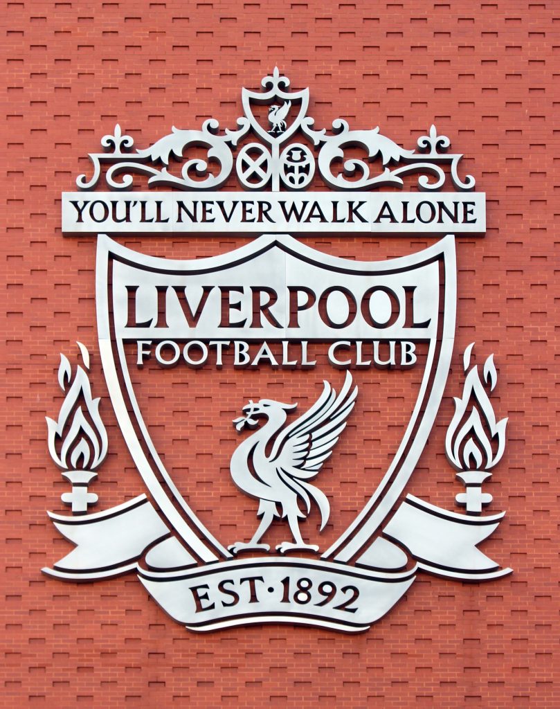
Liverpool FC Crest Changes
Liverpool Football Club’s crest has evolved significantly throughout its history. The early badges featured the club’s name and various symbols, including the iconic liver bird. Over the years, the crest has been redesigned and refined, resulting in a modern and recognizable logo that represents the club’s legacy and success.
Symbolism in Liverpool’s Football Club Badge
The liver bird, a mythical creature associated with the city of Liverpool, is the central symbol in the club’s badge. It represents the club’s connection to the city and its proud heritage. The liver bird is depicted with one claw resting on a football, symbolizing the club’s passion for the game.
From Crest to Emblem: Liverpool’s Logo Transformation
Liverpool’s logo has evolved from a traditional crest to a more modern emblem. The club’s current logo features a simplified and minimalistic design, reflecting contemporary design trends. It embodies the club’s commitment to progress and innovation while honoring its rich history.
Manchester United: From Coat of Arms to Iconic Logo
Early Badges of Manchester United
Manchester United Football Club’s early badges featured a detailed coat of arms, reflecting the club’s historical roots. The coat of arms incorporated various symbols and elements, including the devil, representing the club’s nickname, “The Red Devils.” Over the years, the badge has undergone simplification and refinement, resulting in the iconic logo we see today.
Exploring the Symbolism of Manchester United’s Football Club Crest
The Manchester United crest is filled with symbolism. The red color represents passion and determination, while the devil symbolizes the club’s fierce competitiveness. The ship symbolizes the city’s maritime history, and the combination of all these elements creates a powerful and iconic logo.
The Evolution of Manchester United’s Logo
Manchester United’s logo has evolved from a detailed coat of arms to a more streamlined and modern design. The current logo features a simplified version of the club’s initials, “MUFC,” combined with the iconic devil symbol. It is a symbol of the club’s rich history, immense success, and global fan base.
Arsenal Logo Over the Years
Arsenal’s Emblematic Changes
Arsenal Football Club’s logo has seen significant changes throughout its history. The club’s early logos featured a detailed coat of arms with various symbols, including a cannon. Over time, the logo has been simplified and modernized, resulting in a more iconic and recognizable emblem.
The Journey of Arsenal’s Crest
Arsenal’s crest has evolved to reflect the changing times and design trends. The current logo features a simplified and minimalistic design, focusing on the club’s iconic cannon symbol. It represents the club’s strength, firepower, and historical association with Royal Arsenal.
Exploring the Coat of Arms in Arsenal’s Logo
The coat of arms in Arsenal’s early logos symbolized the club’s historical connection to the Royal Arsenal and the armament manufacturing industry. The cannon represented the club’s strength and firepower. While the current logo has moved away from the coat of arms design, the cannon remains a central symbol, representing the club’s rich history and tradition.
The Storied Past of West Ham United’s Badge
The Origins of West Ham United’s Badge
West Ham United Football Club’s badge has roots in the club’s historical ties to the Thames Ironworks and Shipbuilding Company. The crossed hammers, which were used by the shipyard workers, have become an iconic symbol associated with West Ham. The badge has evolved over the years, incorporating various design elements and modernizing the overall aesthetic.
The Evolution of West Ham United’s Logo
West Ham United’s logo has undergone significant changes throughout its history. The club’s early logos featured the crossed hammers in a circular design. The current logo features a simplified and more modern representation of the crossed hammers, creating a strong and recognizable brand identity.
Symbolism Behind West Ham United’s Football Club Crest
The crossed hammers in West Ham United’s crest symbolize the club’s historical association with the Thames Ironworks and Shipbuilding Company. The hammers represent unity, strength, and the hard work ethic associated with the East End of London. The crest is a visual representation of the club’s proud heritage and identity.
Aston Villa: A Legacy in Logos
Aston Villa FC Crest History
Aston Villa Football Club’s crest has evolved throughout its history. The early badges featured a lion symbolizing strength and courage. Over the years, the logo has undergone modifications and refinements, resulting in a modern and recognizable crest that represents the club’s legacy and success.
Uncovering the Meaning Behind Aston Villa’s Logo
The lion in Aston Villa’s logo represents strength, courage, and the pride associated with the club. It is a symbol of the team’s fierceness on the pitch and their determination to succeed. The logo embodies the club’s rich history and tradition.
Aston Villa’s Logo Timeline
Aston Villa’s logo has seen several transformations over time. From the early badges featuring a lion and the club’s name to the current logo, which focuses on a simplified and modernized rendition of the lion symbol. The logo changes reflect the club’s desire to stay relevant while honoring its heritage.
Crystal Palace: From the Eagles to a Modern Emblem
The Early Logos of Crystal Palace
Crystal Palace Football Club’s early logos featured an eagle, representing the club’s nickname, “The Eagles.” The eagle motif has been consistently incorporated into the club’s logo throughout its history. The current logo features a modern and stylized representation of an eagle, showcasing the club’s evolution and contemporary design trends.
Symbolism in Crystal Palace’s Football Club Badge
The eagle in Crystal Palace’s badge symbolizes
Premier League Badge History
Football is the most popular sport in the world, and the English Premier League is one of the most competitive and sought-after leagues. Every team in the league is proud of their badge, which symbolizes their history and identity. This article will explore the history of the Premier League badge and how it has evolved over the years.
We’ll look at the origin of the badge, early designs, and the current one, as well as the symbolism of the badge and its importance to the league and its teams. We’ll also look at the importance of the badge in helping to shape the identity of the league. So let’s take a look at the history of the Premier League badge and how it has evolved.
Origin of the Badge
You’ve likely seen the iconic Premier League badge around, but do you know where it comes from? The badge first appeared in 1992, when the English Football League First Division was rebranded as the Premier League. The badge was created to represent the top tier of English football and the 22 founding member clubs.
It features a circular design, with four lions on the outer edges and the words ‘Barclays Premier League’. The lions were taken from the royal coat of arms of England, symbolizing strength and courage. The badge is a reminder of the league’s rich heritage and of the clubs that have been part of it since the beginning.
Early Badges
Check out the evolution of English football clubs’ logos over the years! The earliest Premier League clubs sported basic, simple logos that often just featured the name of the team. For example, the badge of Manchester City in the early 1990s was just the word ‘City’ written in blue and white. Similarly, the badge of Tottenham Hotspur in the 1980s was just the words ‘Tottenham Hotspur’ written in white on a black background. This was the case for most Premier League teams at the time, as they had yet to adopt more sophisticated designs.
The logos did, however, become more detailed and colorful over time. The 1990s saw teams begin to incorporate symbols and mascots into their logos, such as Everton’s use of a shield and a mermaid. Meanwhile, Arsenal’s badge in the early 2000s featured a cannon in the background. By the end of the decade, teams began to adopt their current logos, with the Premier League now filled with intricate and eye-catching designs.
The Current Badge
Today, most Premier League teams boast stunning, intricate designs for their logos. The current badges used by most teams are modern and feature a combination of elements that represent the club’s history and values. Most badges are circular or shield-shaped, while some feature more unusual shapes.
The colours used in the logos are often the same as those used by the club in the past, or they may feature a combination of colors that are representative of the region in which the club is based. The logos also typically include an image or symbol that conveys the team’s commitment to excellence and dedication to the sport. Finally, the badges may feature a motto or slogan that encapsulates the team’s values and aspirations.
Evolution of the Badge
Throughout the years, football teams’ badges have evolved as the clubs have grown and changed. The Premier League’s current logo is a combination of its original logo, which was introduced in 1992, and the older Football League logo. Since then, the badge has been modified several times in order to reflect the changing times and the growing popularity of football.
The most noteworthy change was to the badge in 2007, when the Premier League introduced its new ‘lion rampant’ logo. This design was chosen to represent the league’s strength and unity, and it has been used ever since. Other minor changes have occurred over the years, including the introduction of the ‘three lions’ and the ‘star’ in the logo. These symbols are meant to represent the league’s commitment to excellence and its focus on creating a winning culture.
The Badge as a Symbol of the League
The iconic badge of the Premier League is a symbol of pride and unity, representing the spirit of excellence that the teams have committed to achieving. It has been used to represent the league since its inception in 1992 and its design has evolved over time to become an instantly recognizable emblem of the league. The badge features a lion, which symbolizes strength and courage, and three crowns, representing the three divisions of the league.
This design is a clear reminder of the league’s past and also serves to communicate its ambition and commitment to excellence. The badge is a reminder of the league’s values and commitment to excellence, and is a source of pride for all involved in the league. It is a symbol that speaks to the spirit of excellence that is associated with the league and the teams that compete in it.
Conclusion of Premier league badge history
The Premier League badge has come a long way since its inception. It has evolved from a simple motif to a symbol of pride for the world’s most popular football league. The badge’s evolution has been a testament to the league’s commitment to excellence, as well as its ability to remain relevant in today’s ever-changing sports landscape. The badge will continue to be an iconic symbol of the Premier League, and is sure to continue adapting to the times in the years to come.